

Mobile Optimized Websites
WHAT IS RESPONSIVE DESIGN?
Mobile traffic, web traffic on mobile devices, accounts for upwards of 70% of internet traffic today. Websites have been and continue to be one of the most significant assets to any business. Make sure your website works on every screen, whether tablet, desktop, or smart phone.
Our custom-built responsive design websites are designed to work on every screen, making sure your customer's user experience is always the best it can be.
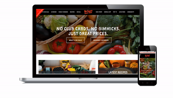
Top Tomato

Blue Velvet Beauty Lounge & Spa
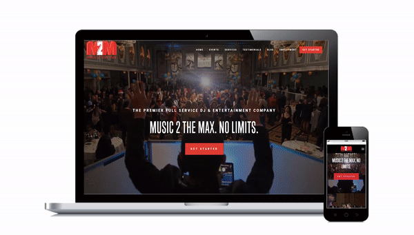
Music 2 The Max
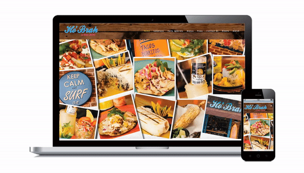
Ho Brah Tacos
CUSTOM BUILD
Our team seamlessly combines your business' brand with the power of the web, extending your reach and influence further than ever before. With sleek designs, contemporary styles, eye-catching custom photography, and expert typography, your company site stands ahead of your competition.
RESPONSIVE DESIGN
Today more than half of digital traffic online comes from mobile devices and mobile apps. Smartphones and tablets, combined, account for 60% of all online traffic. Our websites are optimized for mobile devices, making them quick, responsive, and reliable on any device.
UNLIMITED CHANGES
Need to make changes to your site? No problem. Our developers are in-house and here work with you. No outsourcing. No delays. No red tape. Just results.
Unlimited pages, unlimited edits, ongoing maintenance and updates, SEO optimization, and most importantly, we make having a custom website for your business affordable.
Whether you're looking for a redesign for your current business or building a new website, Valpak Media Solutions can help!